
Hello everyone! This week I wanted to share a couple of methods we used when designing the marketplace screen for our game. Before I continue, a disclaimer - what I'm showing is a work in progress and we're constantly iterating. That being said, this is essentially the final design. Since a picture is worth a thousand words - here's a video showcasing the actual menu in action.
As you can see this is a pretty busy UI. However, I think we did a pretty good job of achieving a few things with it.
Goals
Simply put we were aiming for a fast and intuitive UI, while being easy to learn for new players. One of the main pillars of our game is speed. We want the player to be able to reach information or gameplay as quickly as possible. Because we are basing a lot of our gameplay on classic PC and Console titles we were very cautious of the large amount of information that would be available to the player at a glance. We wanted to show as much information as possible without overloading the player. We also realised we needed to have a way to teach the UI to players without fear of consequences.
Colour Coding
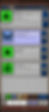
This is a general rule of thumb for any game. Consistent colours make it easier to distinguish between UI elements at a glance. Here are some examples.

Buttons are dark blue unless there is a good
reason for them to be other colours. The cancel button at the bottom is dark red and that is the same colour for cancel in the entire app. Item icons are colour coded for "Rarity" (determines how many bonuses they are generated with). Five buttons on the bottom are using the same colours as the item rarities to signify a connection.
The buy/sell toggle (above the exit button and to the right) have the same colour as the currently highlighted items to show at a glance if the game is in buy or sell mode.
The grey "Gold" icon in the bottom left is consistent with other grey icons in the game. When pressed these icons always display an information popup.
Interactive elements
One of the more important aspects of developing for mobile is the signalling of intent, size and layout of interactive elements.
The item categories at the top of the screen, as soon as you open the marketplace one of those is highlighted this shows the player that they are clickable and will show equipment of the selected category. Unfortunately they have to be quite small because there are is not a lot of space. But we addressed that by never having to click them - you can just swipe left and right!
We have a lot of lists ion our game. It's an action RPG after all. On top of that we have a limited amount of space on screen. In order to signal that a panel is in fact a list in the game we use the same borders. Notice how the item on top has nothing on its sides and the ones below have a very distinct patterned border on the left and right of them.
Speaking of the item panels. When entering the marketplace the first item is always highlighted - this signals to the player that items can be selected.
You probably noticed this already but none of the buttons on this screen have text in them - just icons. This lack of text makes the UI feel less cumbersome, easier to read at a glance. Also, with the limited space on mobile this is the best way to ration your screen space. We tried to make the icons as easy to read at a glance but obviously for a complex game like this sometimes it's impossible to achieve instant meaning with an icon. That is why every button that has a significant function brings up a cancellable popup window describing what is about to happen. We want to teach the player that if they aren't sure what a button does they can press it and learn without fear of consequences.
Conclusion
I hope the above ideas help you designing your own UI. I should say the above works for our game but might not work for yours - there is no one way to design a UI. Critical thinking and having a clear goal are your most important tools!
I think I'll leave it at that for now! Once again - thank you for indulging me! For more information, screenshots and videos on our upcoming game, please follow us on our social media and subscribe to our newsletter!
If you came from any of these please feel free to drop us a message, a comment or join our discord server and say hi!
See you next week!